

Redesign for a fictitious fitness app.
VIRTUALGYM
Roles
Project Overeview
Solo Project
UX Research
UX Researcher
UI Designer
Deliverables
-
Competitive Analysis
-
User Surveys & Interviews
-
Sketching
-
Wireframing
-
Prototyping
Duration: 3 weeks
Why This Project:
This project was a personal project aimed to enhance my UX skills. I used an AI to create a realistic design brief, which was highly beneficial as it created a fictitious company with existing branding.
VirtualGym is a fitness app that offers users a wide range of virtual workout classes, personalised training plans, and tracking features. The app aims to provide a seamless and engaging fitness experience to users of all fitness levels.
The Problems


1. User engagement and retention need improvement.

2. The UI needs a redesign while preserving brand identity.

3. Onboarding is cumbersome.

4. Lacks optimisation for seamless use on both mobile and tablet devices.
Optimise the app for both mobile and tablet devices.
The Solution
Make the app easier to use, more enjoyable and fun
Explore the colour palette further and by adding depth to the visual design.
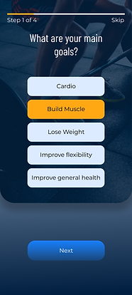
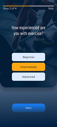
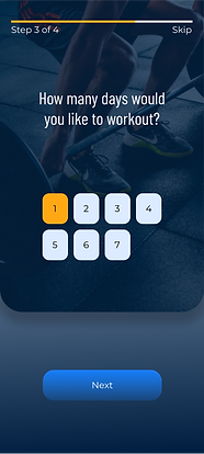
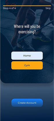
Add simple questions before getting the user to create an account and encourage the user to get started.
Incorporate social and community features to foster user interaction and motivation.
2
1
4
5
3
Research
Competitor Analysis

My research commenced with an analysis of companies offering products similar to what I intended to design. This approach enabled me to identify gaps in their offerings and determine areas where I could focus my attention. By leveraging this insight, I aimed to develop a more comprehensive app that caters to the user's needs more effectively.

Nutrition holds equal significance alongside exercise, ensuring a well-rounded approach to well-being.
Findings

The complete app experience should be accessible to all users

Fostering a sense of community, even in a virtual context, can serve as a powerful motivator for users in their pursuit of achieving their goals.

Establishing a connection with a personal trainer who can monitor your progress and make necessary adjustments is instrumental in ensuring that each individual maximises the value of their training program. This not only prevents monotony in workouts and diets but also guarantees tailored and effective fitness plans.
Opportunities
Meal plan section with ingredients to shop for, can create shopping list.
Live video call with trainer to check in.
Option for each user to mix and match to create a meal plan that suits them.
Community meet ups.
Be able to log past workouts.
1
2
4
5
3
Surveys & Interviews
The next step I took was to find out what potential users might want to have in the app if they were to use it. This gave me valuable information which would help me focus on features that would be most beneficial to the user.
Findings
The main fitness goals in order were to build muscle/improve core strength, increase overall health/ maintain healthy weight and then stress relief.


Tracking nutritional intake was important to most users.

Real-time tracking was quite important to a numbers of users with personalised workouts and guided workouts being important to those interested in yoga/pilates.
Aerobic/cardio were the most popular exercise methods with weightlifting not far behind and then yoga/pilates after this.


Social interaction was important to the majority but others with more focus on weightlifting said it was not a priority for them.

Having features such as workout tracking, progress analytics, nutritional advice/guidance and workout plans based on body type would encourage users to workout more consistently and keep them motivated.
Ideation
Following the data collection phase, I crafted personas to serve as a guiding framework for consolidating and channeling the gathered information.
Personas:
Based on the available data, I fashioned two distinct personas. This division arose from the varied interests of the participants, with some leaning towards weightlifting and cardio exercises, while others were more inclined towards yoga and pilates.

Age: 30
Occupation: Marketing Manager
Location: London
Favourite workouts: Deadlifts, bench press
Favourite gym music: Heavy metal
John is a Marketing Manager in a large International company. Outside of work he loves to lift heavy weights in the gym and look after his diet. Training twice a day, before and after work, requires a lot of dedication. He is always looking for ways to improve the efficiency of his workouts, time spent in the gym and his food intake. He is looking for an all-in-one app that helps him track the weights he’s lifting, an app that encourages him to push himself and an app that gives nutritional advice templates.
.png)
Persona 1
Problem Statement
John is a busy marketing professional who needs an app that makes his gym workouts more efficient because he wants to get the most out of his workouts with the limited time he has.
Persona 2
Problem Statement
Sarah is an Architect who needs a way to track her workouts and provides nutritional advice/plans because she wants to see what her goals are for the week and how she is progressing.

Age: 27
Occupation: Architect
Location: Barcelona
Favourite workouts: Yoga and cardio
Favourite gym music:
Sarah is an Architect living in Barcelona. She enjoys doing yoga 3 times a week and runs to and from work. Eating healthy throughout the day is very important to her and having a plan saves a lot of time. Having an app that will allow her to track how she works out and which gives nutritional advice would be very beneficial for her to track how she progress each day.
.png)
Develop
The next step I took after organising the research information was to begin sketching ideas based on the features that users wanted most. I first explored some design inspiration and created a moodboard which I then analysed to see what I liked and how it might help improve the apps design.
How Might We.....
1
How might we help users monitor their nutritional intake.
2
.How might we encourage users to work out more
3
How might we motivate users to reach their goals.
Information Architecture
I developed a rudimentary diagram illustrating the interconnections between pages, aiding me in identifying any potential gaps in the overall flow. This exercise offered immediate feedback, revealing areas where the user experience could be enhanced and the app's navigation streamlined for improved usability.

Moodboard

Following the completion of the moodboard, I initiated the design process by employing the Crazy 8's technique, generating ideas for each section. I curated the most effective elements from each set of ideas. Utilising insights gained from the Crazy 8's exercise, I translated these concepts into final design sketches. These initial sketches underwent a refining phase, during which I pinpointed the standout sections and features. The culmination of this refinement process resulted in a cohesive layout, which I then translated into a low-fidelity prototype using Figma.

Sketches
Low Fidelity Prototype
Login / Create Account / Onboarding
In designing the initial pages, my primary focus was to create an app experience that would be encouraging and motivational to the users from the outset, offering them a glimpse into the full spectrum of what awaits after they sign-up. By strategically posing a few concise questions before the account creation process, users were gently nudged toward defining their goals. This not only facilitated a smoother onboarding process but also served as a motivational prompt, potentially increasing user engagement and encouraging them to proceed with signing up.


Workouts/meal plan sections
The meal plan section of the app came from user surveys as the majority of users liked the idea of having a section integrated where they could monitor how they ate alongside how they were exercising.
Some of the benefits which came up from users were:
-
Convenience
-
Seamless data integration
-
Better personalisation
-
Efficient goal Management
-
Cost savings
Having everything in the one place means that the goals set by the user can be used more efficiently to create both a workout and meal plan which will make it easier for them to reach their goals.


Final Design
From these low fidelity designs a began creating a style guide that matched the the briefs guidelines. I used vibrant blue and orange colours to create an extended palette to give the design more depth as these colours could be a bit over powering.
As for the typography I chose Barlow Condensed for the headings, the condensed version gives the text a bit more of an edge which I thought suited a fitness app. For the body text I chose Montserrat which complemented Barlow Condensed well because it's simpler and clean.

The high fidelity designs below show how I implemented the colour scheme and the typography. Using the orange colour in a minimal way helped to highlight certain important parts while using different shades of the blue helped to blend everything together.


Headings for information required in each form field added to ensure accessibility for everyone. Instead of using placeholder text in each box.


Orange accent colour used to highlight important information and selections on each page.
This screen shows how the form field currently selected and when information is entered incorrectly or non at all will be highlighted


A lighter shade of blue was used on the yoga screen to give a more relaxed feel.
Next Steps
1
Conduct user testing to gain deeper insights into the design's usability and user experience.
What I Learned
2
Iterate to improve and refine the design based on valuable user feedback.
3
Proceed with the app's development, offering the opportunity to bring the conceptual design to life and assess its real-world functionality.
Throughout this project, I acquired a range of invaluable insights at each stage. Commencing with the importance of crafting detailed personas and identifying the prospective user base. These personas, significantly aided the ideation process by pinpointing the essential features required by different user profiles. Implementing these features effectively promises an enjoyable and seamless user experience.
Furthermore, it became apparent that rigorous testing at the low-fidelity design stage is critical. This approach focuses in on the basic functionality of the app, preventing users from being swayed by the visual aesthetics. By doing so, the feedback primarily revolves around the app's functionality, reducing potential bias caused by the visual design. This iterative and user-centric approach is instrumental in creating a robust and user-friendly application.
Another important aspect of working through the design of this app was to keep referring back to the brief and the information gathered at the research stage. By doing this is kept me on track as I found that it is very easy to get distracted by improving one aspect of the design when another feature is more important .